

Are you overwhelmed by the volume of data your business generates? You're not alone. Every day, businesses worldwide produce around 402.74 million terabytes of data, and the number is only increasing. For project managers, business owners, and leaders, this flood of information can be both a blessing and a challenge. The key lies in not just collecting data but making sense of it—extracting actionable insights that drive informed decisions.
But how can you effectively navigate this ocean of data? The answer is data visualization—a powerful tool that turns raw data into clear, actionable insights. This article explores why data visualization is essential for modern businesses, especially in project management, and how integrating predictive intelligence elevates decision-making. By the end, you'll see why data visualization isn’t just a tool; it’s a strategic imperative.
The Data Dilemma - Why Data Visualization Matters
Imagine sifting through endless rows of numbers in a spreadsheet, trying to spot a trend. Now, picture that same data as a dynamic chart where patterns and outliers stand out instantly. This is the power of data visualization. It transforms complex, abstract data into visual stories that are easy to understand, enabling quicker, more accurate decisions
The Power of Visual Storytelling in Business
Data visualization does more than just present information—it tells a story. For businesses, this storytelling capability is invaluable. Research shows businesses using data visualization tools are 48% more likely to find the necessary information quickly. These tools convert intricate data into clear visual narratives,  making them easier to comprehend and more persuasive.
In a fast-paced business environment, the ability to interpret data swiftly and communicate insights is crucial. This is especially true in project management, where delays in decision-making can lead to missed deadlines, cost overruns, and project failure. Data visualization aids in identifying risks and opportunities enhance communication across teams and ensures everyone is aligned.
Beyond Numbers - The Strategic Role of Data Visualization 
Data visualization is more than a tool for interpreting data; it’s a strategic asset. In project management, it serves as a lens through which you can view the health of your projects in real-time. It helps monitor progress, identify bottlenecks, and anticipate challenges before they escalate.
Without data visualization, project managers might miss subtle trends, indicating a project is veering off course. With it, those trends become immediately apparent, allowing quick, informed decisions that keep projects on track. This ability to visualize project performance and health is not just beneficial—it’s imperative.
Selecting the Right Data Visualization Tool - A Strategic Guide
Choosing the right data visualization tool is critical for maximizing the benefits discussed above. The right tool will not only meet your current needs but also scale with your business as it grows. Here are key factors to consider:
- Define Your Requirements - Before selecting a tool, clearly define what you need it to do. Consider the types of data you need to visualize, the complexity of your analysis, and the audience for your visualizations. This will help you narrow down your options to tools that align with your specific goals.
- Evaluate Ease of Use - The best tools are those that are easy to use, even for those with limited technical expertise. Look for tools with drag-and-drop functionality, pre-built templates, and intuitive interfaces. A user-friendly tool will streamline the visualization process, allowing users to focus on analysis rather than struggling with the software.
- Consider Scalability - As your business grows, so will your data. Choose a tool that can handle increasing data volumes and complexity without compromising performance. Scalability ensures that your data visualization solution remains effective as your business evolves.
- Assess Interactivity Features - Interactivity is key to engaging users and allowing deeper exploration of the data. Look for tools that offer features such as filtering, drill-down capabilities, and dynamic data updates. Interactive visualizations enable users to explore the data in real-time, uncovering insights that static reports might miss.
- Evaluate Integration Capabilities - Your data visualization tool should integrate seamlessly with your existing data sources and analytics platforms. This ensures that you can easily access and visualize data from multiple sources without the need for manual data preparation or duplication. Look for tools with robust integration capabilities, including APIs and connectors.
- Assess Customization Options - Every business has unique needs when it comes to data visualization. Choose a tool that offers extensive customization options, allowing you to tailor visualizations to your specific requirements. Customization capabilities help you align visualizations with your brand identity and analytical objectives.
- Consider Collaboration and Sharing Features - Collaboration is essential for data-driven decision-making. Choose a tool that offers features such as shared dashboards, commenting, and real-time collaboration. These features make it easier for teams to work together and for stakeholders to stay informed.
- Evaluate Support and Training Resources - Finally, consider the level of support and training offered by the tool’s vendor. Look for vendors that provide comprehensive documentation, tutorials, and training materials. Additionally, ensure that the vendor offers robust customer support options, such as email, phone, or live chat, to assist with any issues that may arise.
Selecting the right data visualization tool is an investment in your organization's future success. By carefully considering these factors, you can ensure that your chosen tool will not only meet your current needs but also adapt and grow alongside your business.
Benefits of Combining Data Visualization with Predictive Analytics
In today’s competitive business landscape, data-driven decision-making is crucial. The combination of predictive analytics and data visualization is revolutionizing project management by enabling more accurate forecasting, proactive risk management, and efficient resource allocation. Here’s how these tools are transforming the way projects are managed:
- Forecasting
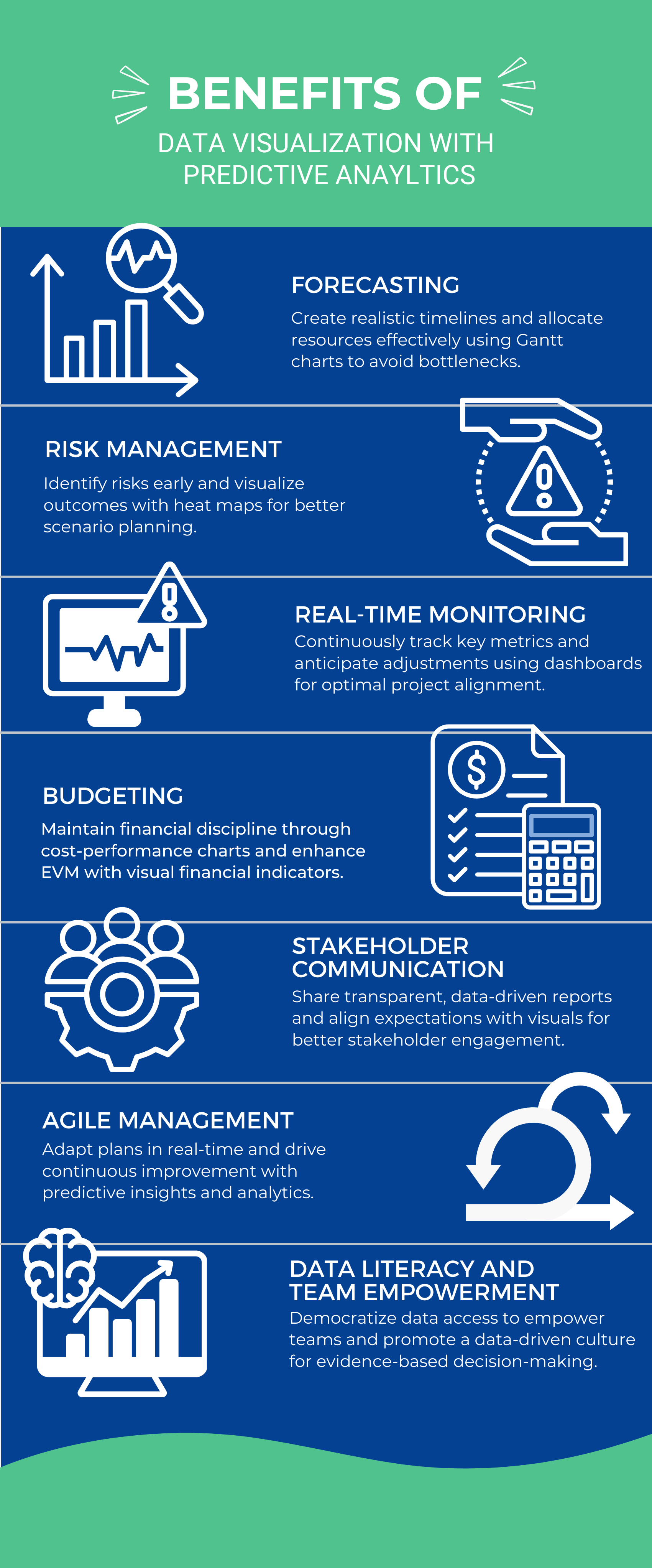
Realistic Timelines - Predictive models provide accurate project timelines, visualized through Gantt charts, allowing project managers to plan with precision and avoid delays.
Resource Planning - Forecast resource needs effectively to allocate them where they’re needed most, ensuring optimal utilization and preventing bottlenecks.
- Risk Management
Early Risk Detection - Use predictive tools to identify potential risks early, visualized through heat maps, which helps in taking preemptive actions to mitigate these risks.
Scenario Planning - Visualize different outcomes to choose the best course of action under uncertainty, making informed decisions that steer projects toward success.
- Real-Time Monitoring
Continuous Tracking - Monitor project performance continuously with predictive dashboards that highlight key metrics, enabling project managers to stay on top of developments and respond swiftly to changes.
KPI Tracking - Keep an eye on KPIs and anticipate future performance to make timely adjustments, ensuring that projects remain aligned with goals.
- Budgeting
Cost Forecasting - Predict budget needs and visualize spending with cost-performance charts, helping to maintain financial discipline and avoid budget overruns.
Financial Tracking - Enhance Earned Value Management (EVM) with clear, visual financial progress indicators, allowing for better financial control and informed decision-making.
Visual Reporting - Share data-driven, visual reports with stakeholders for clear and effective communication, fostering transparency and trust in project outcomes.
Expectation Setting - Use visualizations to set and communicate realistic expectations, ensuring that all stakeholders are aligned and informed throughout the project lifecycle.
- Agile Management
Adaptive Planning - Make real-time adjustments to project plans with visualized predictive insights, allowing teams to remain agile and responsive to changes.
Continuous Improvement - Drive ongoing process improvements through predictive analytics, leading to enhanced project outcomes and operational efficiency.
- Data Literacy and Team Empowerment
Democratizing Data Access - Data visualization democratizes access to information, allowing employees at all levels to engage with data directly. This accessibility empowers teams to make informed decisions without relying solely on technical experts.
Fostering a Data-Driven Culture - By promoting the use of data visualization, organizations cultivate a culture where decisions are based on evidence rather than intuition. This shift towards data-driven decision-making enhances overall business outcomes and drives continuous improvement.
The integration of predictive analytics and data visualization is not just a trend; it is a transformative approach that enhances every aspect of project management. By leveraging these tools, organizations can ensure that their projects are not only well-managed but are also positioned for long-term success.
The Future of Project Management
The future of project management is increasingly driven by the power of data visualization. In a world overflowing with data, transforming raw information into clear, actionable insights is critical. Data visualization turns complex datasets into intuitive visuals, enabling project managers and business leaders to quickly identify trends, spot risks, and make informed decisions. It’s not just about seeing the data; it’s about understanding it at a glance, which is essential for staying agile and competitive.
As data visualization paves the way, its integration with predictive intelligence takes things a step further, enabling businesses to understand the present and anticipate the future.
This is where TrueProject excels. TrueProject is an advanced KPI-based predictive project management solution that integrates powerful data visualization with advanced predictive analytics. It provides real-time risk identification, optimizes resource allocation, and offers early warning signals to prevent issues before they escalate. With its user-friendly interface and seamless integration capabilities, TrueProject empowers your team to adopt a data-driven approach, ensuring continuous improvement and project success. If you’re looking to foresee project challenges and gain optimal insights through data visualization, TrueProject is the solution that will keep you ahead of the curve.
More information on TrueProject at trueprojectinsight.com
